Tuesday, April 26, 2016


http://youtu.be/OAim-9ZdXI4


http://youtu.be/pwA51ktwN2Q

Tuesday, April 12, 2016


Project 5: Representational Flag 

This flag, along with its compound color scheme, is a representation of my personality: Calm, Easy-going, Intuitive with nature, Open-minded 

Thursday, March 24, 2016


Top: Triadic color scheme of green, red, and blue.
Bottom: Complimentary color scheme of purple-blue and yellow-green

My color schemes incorporate different chromas of the colors to create depth and visual interest


Tuesday, February 16, 2016

This is my first attempt at color vibration prints. It's hard to see, but it's an image of an incense stick and smoke flowing up. My pattern is inspired by a 70s poster of a peacock. I might stay with this pattern but change my composition up. There needs to be more going on in my opinion. I'd also like to make the tiles smaller and possibly change my complimentary colors.

Wednesday, February 10, 2016


**Accidental homework** - Advancing and Receding colors that convey different tones and meanings. One is whispering Hello, one is simply saying Hello, and the other is shouting Hello. Can you guess which one? 

I really enjoyed this activity because I have known this optical illusion but to instantly see it happen was cool. After staring at the top square with purple and yellow-green, you will notice an "after image of perceptual complementary colors." After that, you will notice that the below yellow- green and purple square appear more vivid.

"When used together, warm, high-value, high-chroma colors appear closer in distance than cool, low-value, low-chroma colors. These are advancing and receding colors." In fewer words, cooler colors tend to recede while warmer colors advance.

Friday, January 29, 2016


This post shows the Munsell color set according to proper colors and their chroma. What I enjoyed most about piecing together this puzzle is that I am training the cone receptors in my eyes to identify color. There's a whole science behind this and I love that there is literally more than what meets the eye when it comes to learning color.

Thursday, January 21, 2016


Good example of color: 

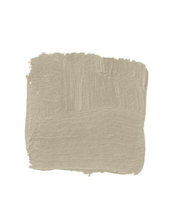
 My major is Interior Design so I chose an example of color used in a small space. The reason that this color is good is because it successfully opens up this small space by allowing a lot of light in. Lighter colors will reflect light instead of retaining them. Also, since this color is very neutral and warm, it helps simplify the space so there's less attraction to the walls and more attraction toward the light source or window(s). Although I am not certain what color these particular walls are, it falls under a taupe similar to this one:

DUNN-EDWARDS NOMADIC TAUPE DE6192: "This is a soothing sand color that expands a space and creates a feeling of warmth and continuity, especially if you use it on the ceiling and the walls. I like the way it takes on the color of the light coming in and yet keeps its own integrity. It's the perfect backdrop. The neutral walls recede and you focus more on the furnishings than on the size of the room." -William Miller
Dunn Edward's "Nomadic Taupe" DE6192